If you’ve visited levi.com or dockers.com recently, you probably noticed some pretty significant changes. That’s because our Direct-To-Consumer team has been hard at work building lightning fast, next-level websites that officially launched in Canada, Europe and the U.S. this August for the two brands.
The site upgrades are part of Levi Strauss & Co.’s broader efforts we are calling “NextGen” to position us as a world-class, omni-channel retailer that delivers an authentic, compelling and consistent consumer experience globally.
NextGen
LS&Co. officially began with NextGen in our stores — now it’s gone digital, bringing that experience to both the desktop and mobile versions of levi.com and dockers.com.
The team focused on delivering an enhanced, unified consumer experience on any device by narrowing in on two core areas: the omni-channel experience and elevating Levi’s® and Dockers® through immersive brand storytelling.
Omni-channel Experience
Using a technology called headless architecture, the consumer experience is faster, more seamless and frictionless across devices.
Other changes include:
- A streamlined cart and checkout experience that makes it easier to communicate promotions and add products directly to your bag.
- An upgraded payments page for U.S. sites.
- Simplified search functionality, which now includes three navigation options at the top of levi.com: Discover, Customize and Shop. On dockers.com it includes: Discover, Shop and Find Your Pant.
Consumers can also see trending and popular searches with product visuals.
Elevated Brand Experience
The NextGen sites blend brand storytelling directly into the shopping experience, ensuring the LS&Co. brand voice is captured in the best way possible. Consumers can think of the site as their “always on, flagship store.”
Now, the full Levi’s® brand expression and stories are at the forefront of levi.com. Stories centered on brand values, sustainability and customization are weaved directly into the shopping journey — extending beyond traditional channels like the blog and homepage. For example, the Product Listing Page displays merchandise and while you scroll, there may be a sustainability message or fit education.
Other changes include the ability to have themed site takeovers and change the Levi’s® logo for specific events and promotions, like a rainbow logo for Pride and the inclusion of more immersive imagery that allows for movement like gifs or a scrolling marquee on the site.
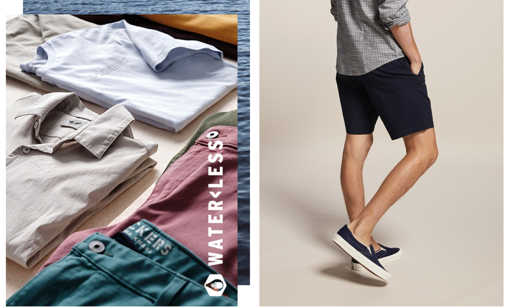
For Dockers®, one of the team’s key strategies is to leverage our digital channels to attract younger consumers and meet their needs with more casual clothing and a California vibe. This new site will help dockers.com achieve this strategy and deliver the “best expression of Dockers®” through more integrated brand storytelling, clear flags for sustainable products, better product imagery and video, and the seamless experience that shoppers expect today.
Check out the changes for yourself — visit levi.com and dockers.com now.


